Introduction
In this e
ssay I will identify 3 artists and review them, talking about the techniques and materials they use to create their art pieces but firstly to talk about the subject matter and what my opinion of the work is. The work and artists I have chosen have been selected from the Lecture Jamie's influences on his blog.
Chris Thornley
The first artist I will be talking about is Chris Thornley or better known as "Raid71".
The artwork I've looked at would be:
I feel this work is a design sense is superb in quality. The artist has obviously use Photoshop on the imagery and Adobe inDesign with the text. The colour scheme of the art work shows a grunge cornered outside while the darkness on the colours give the center piece more attention and bring the lips out more. The lips on the other hand are downgraded on levels of shadows. They seem to be showing the light and shade i
n levels with the teeth remain the same. I feel this brings more of a design effect to the piece and shows the artists attention to detail without making it over noised or distorted. The artwork is a cover piece for a book titled "Super Girl" While all you get from the image work is that lip being bitten in a seductive way. While this gives the reader interest it does not give anything of the story away. The materials used in this art piece would be a stock photo of the lips and maybe a texture stock photo for the corners.
In his Latest work shown below:
He pays respect to the late steve jobs, who recently passed away. I find this art piece very striking and relatable. As the apple logo has been redsigned to show the bite mark replaced witch steve job's head. Obviously having the text simplistic in appearance and leaving the whole piece to show attention and commiseration to Mr Jobs. The technique in this artwork is very simple, the apple is cut by using steve jobs head and making a insertion into the apple with a marque tool in photoshop. Once having the head cut, changing to the apple layer and making the cut. The materials are very simple an Apple logo and a picture of steve jobs.
The final piece below:

This is an editorial piece named "epilipse" and is probably one of the most interesting pieces from the artist. The subject matter is that of a woman with no eyes, though her hair has alien elements drawn in. I suspect that Adobe Illustrator has been used for this work. The techniques to creating work of this kind are little more complex than the works above. Obviously a stock photo of the woman would be needed to work off of. The woman is drawn roughly on the shades of her picture. With lines showing the shaded areas, while her hair seems to go up into the artwork and the scratched into her hair, it shows alien features like a saucer, an alien face and an eye. Drawing these would have been easier then to transfer them to Illustrator. Materialistic wise I think if that has been drawn first, simply drawing with an graphics pen would be the wiser thing to do. To add to a plain black and white drawing circles in the colours of red, blue and green have been put into the background. While the background colour itself is a very creamy colour which gives the vintage feel. I think that this whole piece in general is very vintage and 60's look to the work.
Jack Kirby
The second artist I have chosen to look at is Jack Kirby, an american comic book artist whose work is seen everyday in very famous comic book art.
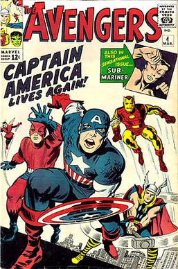
The first piece I will be looking at is a comic book cover of the Avengers #4 from 1964:

Straight away as a geek myself I'm amazed at the artwork and the age of it. To think that in 1964 this was the standard of comic book artwork it makes me realise how much hasn't changed. Obviously the subject matter is pretty much what you see is what you get. The Avengers comic book is very famous and the artwork is legendary. There was no technology back in these days for graphic work so this obviously hand drawn. The materials would be graphic pens and colouring. With no stock photo's to work from but drawings, the artist had to be much more imaginative back then and just draw from what they think and see. The technique I would imagine would be stage by stage and then to fianlly add colour. The comic book shows an action frame of all the avengers together charging towards the front of the comic book, this gives a very energetic and action filled picture to readers imagination and shows how interesting the inside would be.
The 2nd piece from jack kirby:
This is another comic book cover for the Bombast #1 from 1993.
As you can see the differences in quality from the 1st piece, there is a lot more attention to detail when it comes to character drawing. While a lot more work would go into creating something like this, I imagine the techniques remain the same. The increase in detail and colours wouldn't be because the artist became more skillfull but technology in printing increased and made the amount of colours per inch increase. While this piece shows the character throwing some sort of missile. The technique to draw this i would imagine would require more measure and symmetrical tools to make the work seem more professional and more realistic. The background is hard to describe as it seems a very dirty, splatter and grunge feeling. The colours are a dirty orange, a dark woods green with some black and some line shading around the end of the artwork.
Robert E. McGinnis
Robert McGinnis is an american Illustrator whose work is infamously famous and has worked on over 1200 paper covers and over 40 Movie posters.
The 1st art piece I will look at is the famous James Bond Film poster:
I find comparing this to the other artists, I'm amazing at the artwork. This is more sort of my work where I would be able to draw/design like this. The work shows the film Bond film: Diamonds are forever and is famous as it had to be re-worked due to the artists misplacing of the diamonds. The critics and viewers described the placement of the diamonds to be in a rude form. While the artwork was never in question. The piece shows a lot of detail including features from the film, explosions and bond with his lady friends. The techniques to draw and create something like would be a lot of planning and stages. The film feature on screens in 1971 and back then there wasnt that much technology to help artists in their work. Using imagery of the helicopters to draw and get the whole composition and flow of the art work.
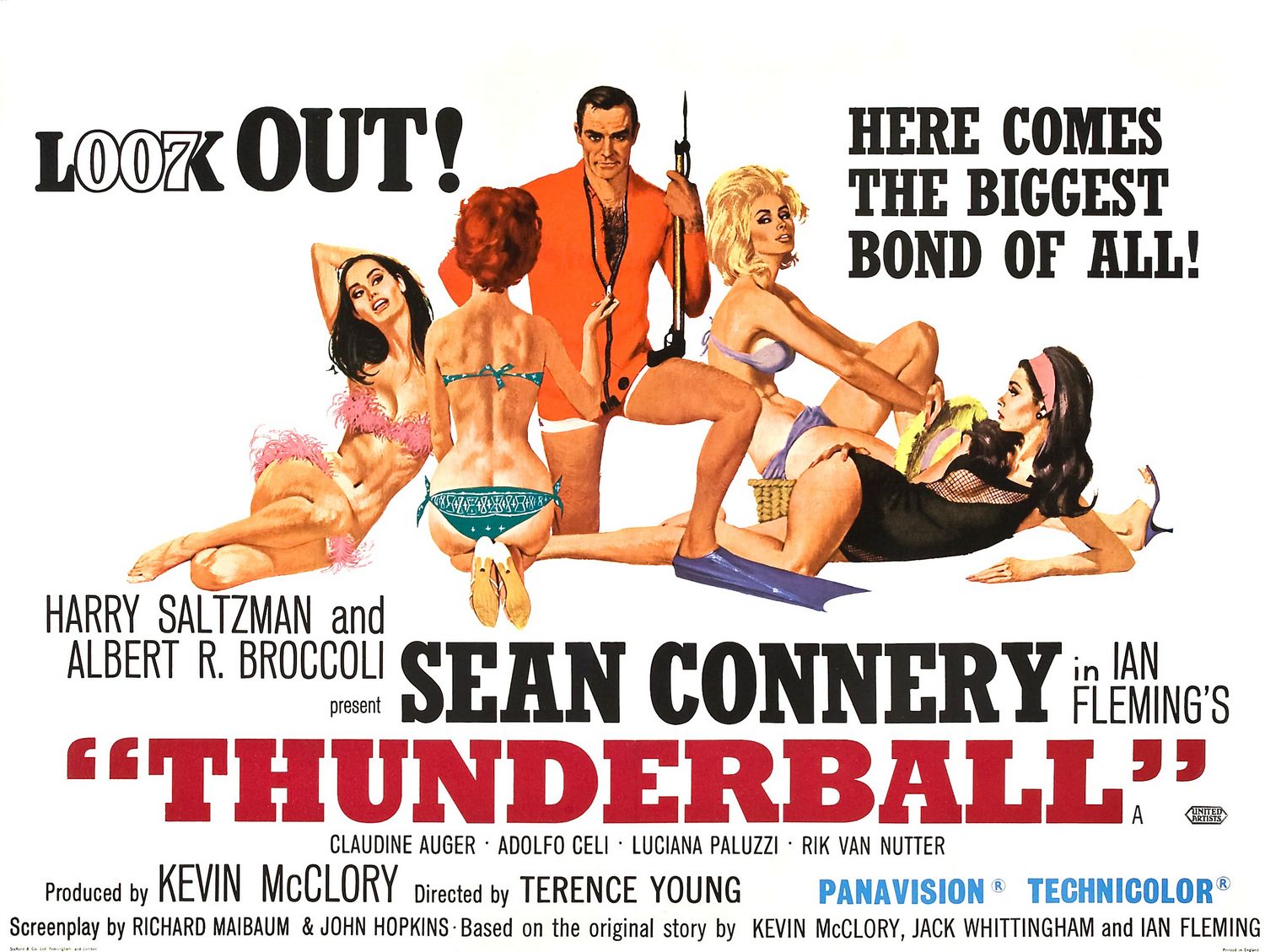
The second piece of work is the 1965 poster for Thunderball:
Again another piece with the female body which the artist draws with perfection. The shading and colours of the bodies are close to realistic. The typography of the "LOOK OUT" is ingenious using the infamous 007 label with the word: Look. All techniques to design something like this would be to draw by hand and the artist shows the skill from his hand on this piece. The attention to detail and the colour variation shows a strong vibrant feeling. There is now real materials that would be used other than to draw from a photo or several and make the flow of the composition work.
Conclusion
The conclusion of the essay and research shows 3 artists so greatly skilled in their area of work. In all the art pieces I've shown how much attention detail can be show in the smallest of spaces. How techniques can create backgrounds to emphasize the main feature or drawing at the front of the work. As well as detailing and a lot of colours, the first few artworks show simplistic value yet effective flow and composition. How something with so little detail but with the right flow and colours can an artwork piece become very likeable and to get the reader thinking. As well as thinking the artwork has to sell whatever it is promoting. Clever techniques in the typography of the 007 poster and the word "LOOK" show how effective clever wording and symbolism can be. In the comic book art, it shows the origination and idea behind vector drawing and where we are today with that idealistic artwork.